Chapter 5: Interface (UI) and Interaction (UX)
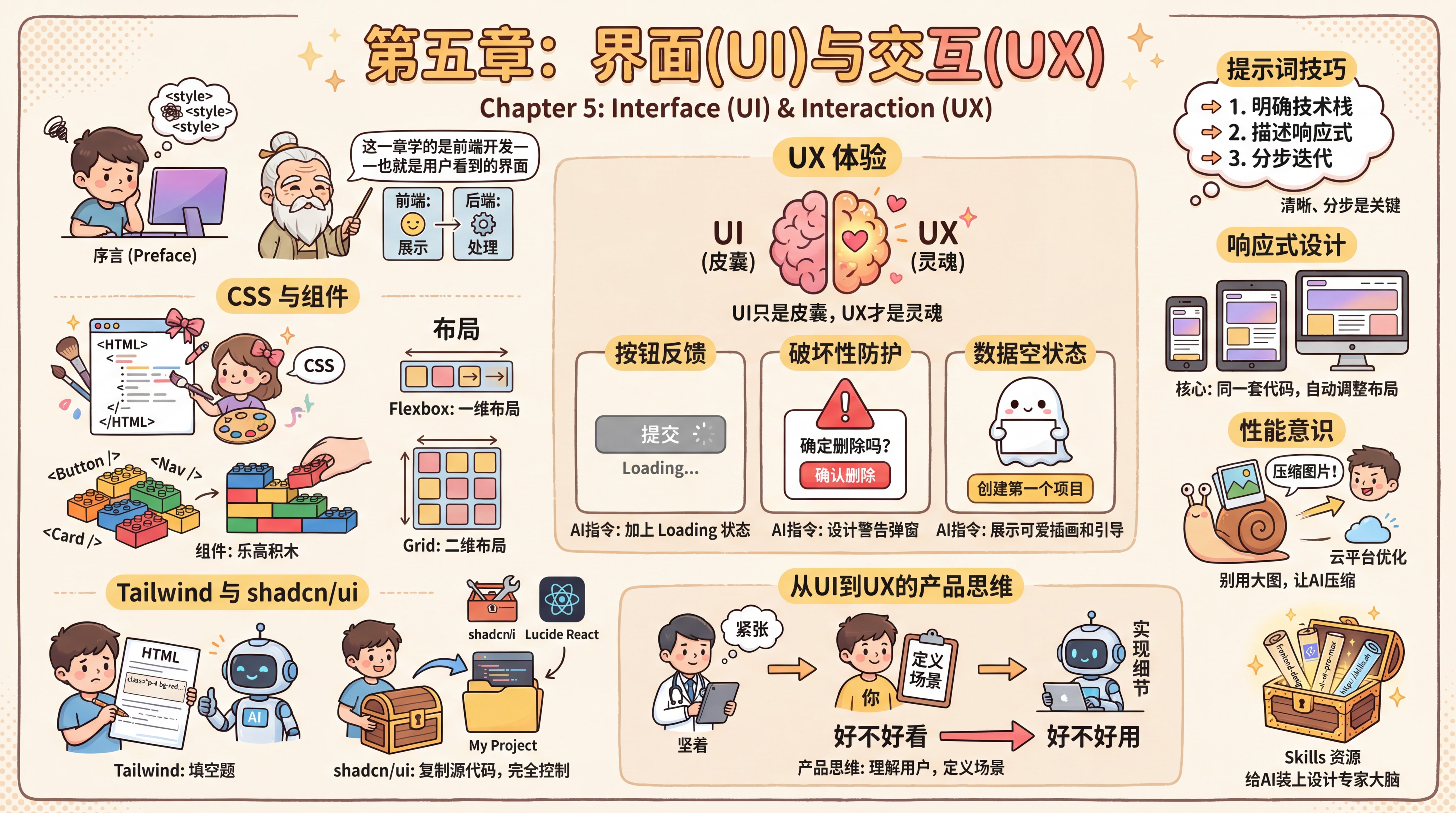
Preface
Looking at the AI-generated webpage on your screen, you feel it’s just too ugly—especially that purple gradient, which feels painfully generic. You try asking the AI to make the buttons look nicer, but the result is a bunch of extra <style> tags in your code. Fix one thing, break another, and after all that effort, it still doesn’t match what you had in mind.
The mentor tells you that this chapter is about front-end development—that is, the interface users actually see. Earlier (in the development fundamentals), you already learned the difference between the front end and the back end: the front end is responsible for "presentation," while the back end is responsible for "processing." Here, we’re only focusing on the presentation side.
CSS and Components
The mentor tells you that to solve this problem, you first need to understand two concepts: CSS and components.
- CSS (Cascading Style Sheets): If HTML is the skeleton of a webpage (bare-faced), then CSS is the makeup. It determines whether a button has rounded or sharp corners, whether the background is a gradient or a solid color.
- Component: Modern webpages aren’t drawn—they’re assembled. Navbars, buttons, input fields—these are all prebuilt Lego blocks. You don’t need to hand-code a "red button with rounded corners, a shadow, and a hover color change" every time. Instead, you can just grab a block called
<Button />and use it directly. - Layout: How elements are arranged on a page is determined by the layout system. When you scroll a social feed and content appears one item after another from top to bottom, that’s Flexbox at work; when you open Xiaohongshu and photos fill the screen like a checkerboard, that’s Grid in action. You only need to tell the AI "arrange these three buttons horizontally" or "split the page into left and right columns"—it can handle the specific properties.
Tailwind and shadcn/ui
Once you understand the concepts, the mentor recommends shadcn/ui. But before introducing it, he first helps you understand its foundation—Tailwind CSS.
Traditional CSS is like writing an essay: you need to give each element a name (such as login-box), then describe its width, height, and colors in a separate file. This easily leads to naming collisions—you call something card, the AI also calls something card, and now the two styles conflict and the page falls apart. Tailwind, on the other hand, lets you write class="p-4 bg-red-500 rounded-lg" directly in the HTML tag. It’s like AI being best at fill-in-the-blank questions—asking it to "stack descriptive words" is far more reliable than asking it to "manage complex file references."
Then comes shadcn/ui, a set of high-quality components built on Tailwind. The mentor makes a point of emphasizing that it’s completely different from traditional component libraries (such as Ant Design). It isn’t a black box installed in node_modules; instead, its component source code is copied directly into your project via the command line. That means you have full control over that code. AI can not only use these building blocks, but also directly modify their internal structure to meet your special needs—this is practically tailor-made for AI-driven programming.
You learn to consult the official shadcn documentation, extract the essential parts (such as how to use Form components), and feed them to the AI to force it to write code according to the conventions of your current tech stack. You also specifically choose Lucide React as your icon library, because AI often makes up icon names out of thin air, and using a standard library keeps it from freelancing too much.
UX Experience
But looking good alone isn’t enough. The mentor tells you that UI (interface) is just the shell—UX (experience) is the soul. You start trying to use AI as an interaction designer, not just a code generator. Instead of directly ordering it to draw a page, you describe the scenario and let the AI help refine the interaction logic. The mentor gives a few classic UX pitfalls to avoid:
- Button feedback states:
- Bad example: The user clicks the "Pay" button and nothing happens. They think the click didn’t register, so they click repeatedly and get charged twice.
- AI prompt: "Please add a Loading state to this submit button. After the user clicks it, the button should turn gray, show a spinning animation, and become unclickable until the request finishes."
- Protection for destructive actions:
- Bad example: The user clicks the "Delete" icon and the data disappears instantly. One accidental tap, and they regret it immediately.
- AI prompt: "This delete action is too dangerous. Please design an AlertDialog that requires the user to click a red 'Confirm Delete' button, or even type 'DELETE' before the deletion can proceed."
- Empty states for data:
- Bad example: A new user signs up, has no data yet, and sees a completely blank page that looks like a bug.
- AI prompt: "When the list has no data, don’t leave it blank. Please show a cute illustration component and add a call-to-action button labeled 'Create your first project.'"
Prompting Tips
When using AI to build UI, the way you write prompts directly affects the results. When creating components, be explicit about the tech stack and component source: "Create a login form with an email input, password input, and login button using shadcn/ui components and Tailwind CSS." When improving layout, clearly specify responsive requirements: "Optimize this page layout using responsive design—single-column on mobile, two-column on desktop." A common beginner mistake is asking the AI to generate a complex page all at once (you should do it step by step), ignoring responsive design (you should mention it early), or over-designing (you should start simple and iterate). UI development is essentially about stacking styling details, and AI tends to make mistakes in the details, so keeping prompts clear and iterating step by step is key.
With AI’s guidance, you design interaction flows that are not only visually appealing (UI), but also easy to use (UX). You even have the AI update these decisions back into your PRD document, ensuring the document remains the latest "single source of truth."
You seem to realize something: VibeCoding is essentially about you setting the standards based on documentation (choosing component libraries, defining workflows), and then letting AI fill in the blanks.
The mentor says: "Ugly is a minor issue—usability is what really matters. AI can generate beautiful pages, but it doesn’t know which designs actually meet user needs. The core of good UX is understanding user scenarios, not showing off technical tricks."
Responsive Design
The mentor adds an important concept: "Modern users visit your site on all kinds of devices—phones, tablets, computers. Screen sizes range from a few hundred pixels to several thousand. If you only design for desktop, mobile users may see a broken layout or text that’s too small to read." It’s like the same article automatically becoming a single-column reading experience on a phone and a two-column layout on a computer—the content stays the same, but the formatting adapts to the screen.
The core of responsive design is using the same codebase to automatically adjust the layout based on screen size. For example, showing a single column on mobile and two columns on desktop; hiding secondary information on mobile while displaying the full content on desktop.
This allows your product to provide a good experience across all devices. The good news is that AI can help handle these layout details. You only need to make it clear in your prompt that it should "adapt for mobile" or "show a single-column layout on phones," and the AI will use the appropriate CSS techniques to implement it. Understanding the concept is enough.
Performance Awareness
Before wrapping up this chapter, the mentor also reminds you to keep performance awareness in mind when building interfaces.
You might choose a high-resolution image as a background, and the file could be several megabytes. On a mobile network, users might have to wait more than ten seconds before they can see anything. Many users won’t wait that long—they’ll just close the page.
So when choosing images, keep file size under control. If you really need to use a large image, you can ask the AI to help compress it.
But the mentor also says: "You don’t need to dive too deeply into performance optimization right now—get the functionality working first. Once you deploy to a cloud platform, the platform will automatically handle many optimizations for you, such as image compression and faster delivery. After launch, once you have real users, if they report that things are slow, then consider further optimization. Premature optimization is a waste of time."
Product Thinking: From UI to UX
Before ending this chapter, the mentor helps you complete a cognitive leap.
He says: "Now you know how to make a beautiful interface, but let me ask you a question—who is your interface for?"
You freeze. You really haven’t thought about that. You just felt the purple gradient looked bad and wanted to switch to a blue palette; you thought the buttons should be rounder and the shadows softer. But do those things really matter to users?
The mentor continues: "UI (interface) is surface-level, UX (experience) is the essence. No matter how beautiful a button is, if users can’t find it or don’t understand when to click it, the design has failed."
You begin to understand: AI is good at writing CSS and stacking styles, but it doesn’t know who your users are or in what context they use your product. Those "why" questions can only be answered by you.
So, the product thinking behind VibeCoding works like this:
- You are responsible for understanding users: Are your users doctors or students? Are they using the product on the subway or in an office? Are they in a hurry or casually browsing?
- You are responsible for defining scenarios: "This button is clicked after the user finishes filling out a long form. At that moment, they’re nervous and afraid of losing their data."
- AI is responsible for implementing the details: Based on the scenario you describe, AI knows it should add a Loading state, save drafts locally, and clearly tell users "Submission successful"
That is the leap from UI to UX: shifting from "Does it look good?" to "Is it easy to use?"
The mentor says: "Good design isn’t about flashy technical tricks—it’s about understanding users. AI can help you draw the most beautiful button, but only you know what users truly need."
Skills Resources
You notice that although AI-generated code runs, the design still always feels a little off. Remember how you fed shadcn docs to the AI so it would write code according to the conventions? Skills does the same thing—except someone else has already organized that "style guide" for you, and you can load it with a single command.
Common UI/UX-related Skills:
| Skill Name | Purpose | Install Command |
|---|---|---|
frontend-design | High-quality front-end interface design | npx skills add https://github.com/anthropics/skills --skill frontend-design |
web-design-guidelines | Web interface design standards review | npx skills add https://github.com/vercel-labs/agent-skills --skill web-design-guidelines |
ui-ux-pro-max | Professional UI/UX design guide | npx skills add https://github.com/nextlevelbuilder/ui-ux-pro-max-skill --skill ui-ux-pro-max |
building-native-ui | Native mobile UI development | npx skills add https://github.com/expo/skills --skill building-native-ui |
audit-website | Website UI/UX audit | npx skills add https://github.com/squirrelscan/skills --skill audit-website |
For installation and usage details, see https://skills.sh
Section Navigation
The next few sections are not meant to make you relearn front-end development from scratch. Instead, they give you a toolbox and inspiration library. You don’t need to memorize everything—just know that "this kind of thing exists" so you can come back and look it up when your project needs it.
- 5.1 AI Design Tools (./01-ai-design-tools.md) 🟡
    Google AI Studio, v0.app, Figma, Google Stitch...when should you use these AI tools built specifically for UI?

- 5.2 Component Libraries (./02-component-libraries.md) 🟡
    shadcn/ui, Ant Design, Element Plus, TDesign...when should you use which prebuilt building blocks?

- 5.3 Animation and Interaction Libraries (./03-animation-libraries.md) 🟡
    Motion, GSAP, Three.js...options for making your page "come alive"

- 5.4 UI Styles and Inspiration (./04-ui-inspiration.md) 🟡
    Awwwards, Dribbble, Mobbin...where can you find references? How do you describe a style to AI?

- 5.5 Effects That Make Pages Feel More Premium (./05-advanced-effects.md) 🟡
    Parallax scrolling, 3D flips, skeleton screens...those effects that make a page look "premium," along with the corresponding prompts

- 5.6 Turning Component Libraries into Skills (./06-component-skills.md) 🔥 NEW
    Transform your project’s component library into Skills that AI can understand, enabling design system constraints and consistency