5.2 Component Libraries
Goal of this section: Understand the characteristics and best use cases of mainstream component libraries, and learn how to choose the right one based on your project needs.
A component library is like a set of prebuilt "LEGO blocks." You don't need to hand-code buttons, input fields, or dialogs every single time—just use what's already built. As the veterans say: "Choose the right component library, and you'll save 80% of your UI work."
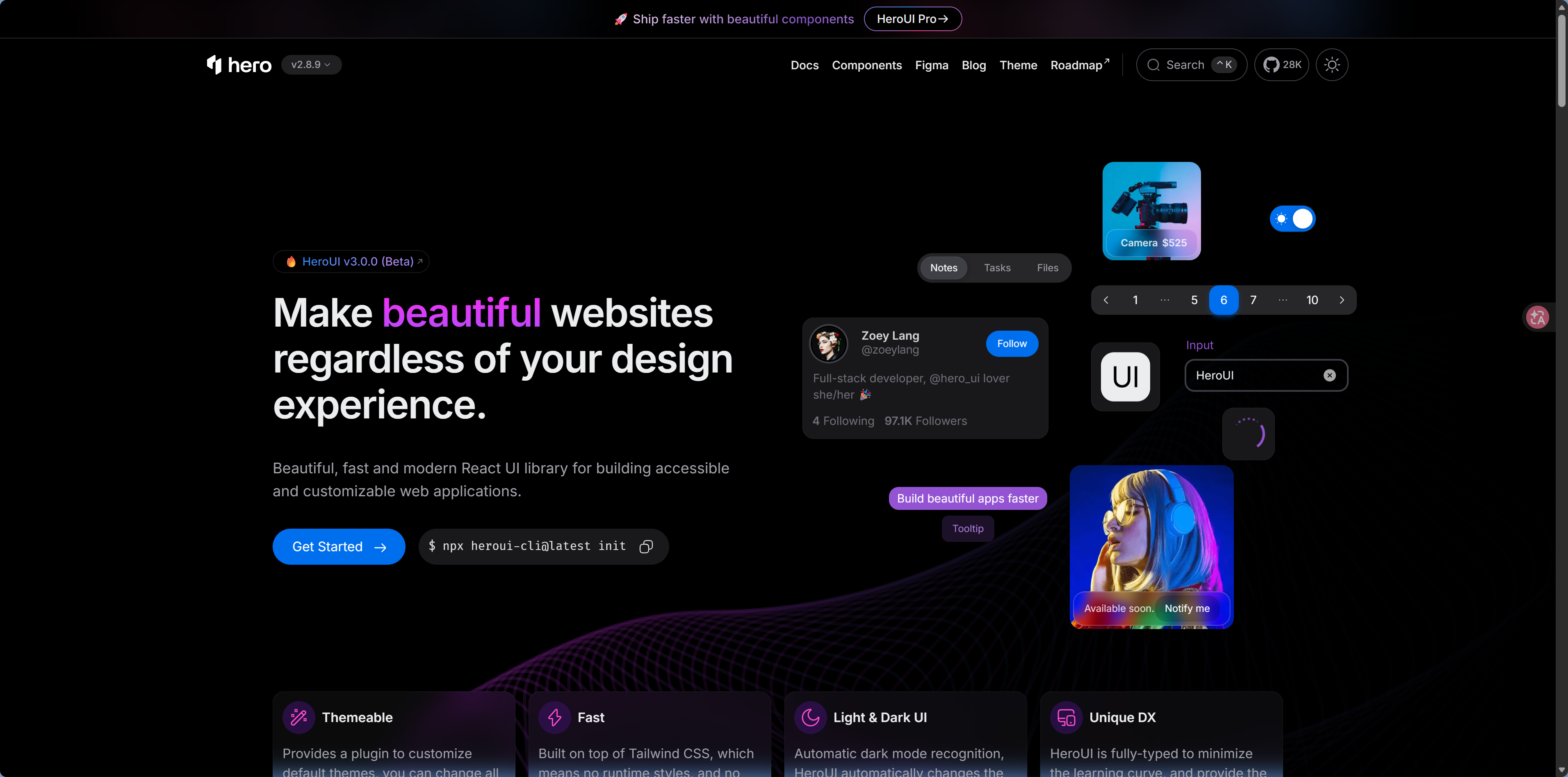
shadcn/ui (Recommended)
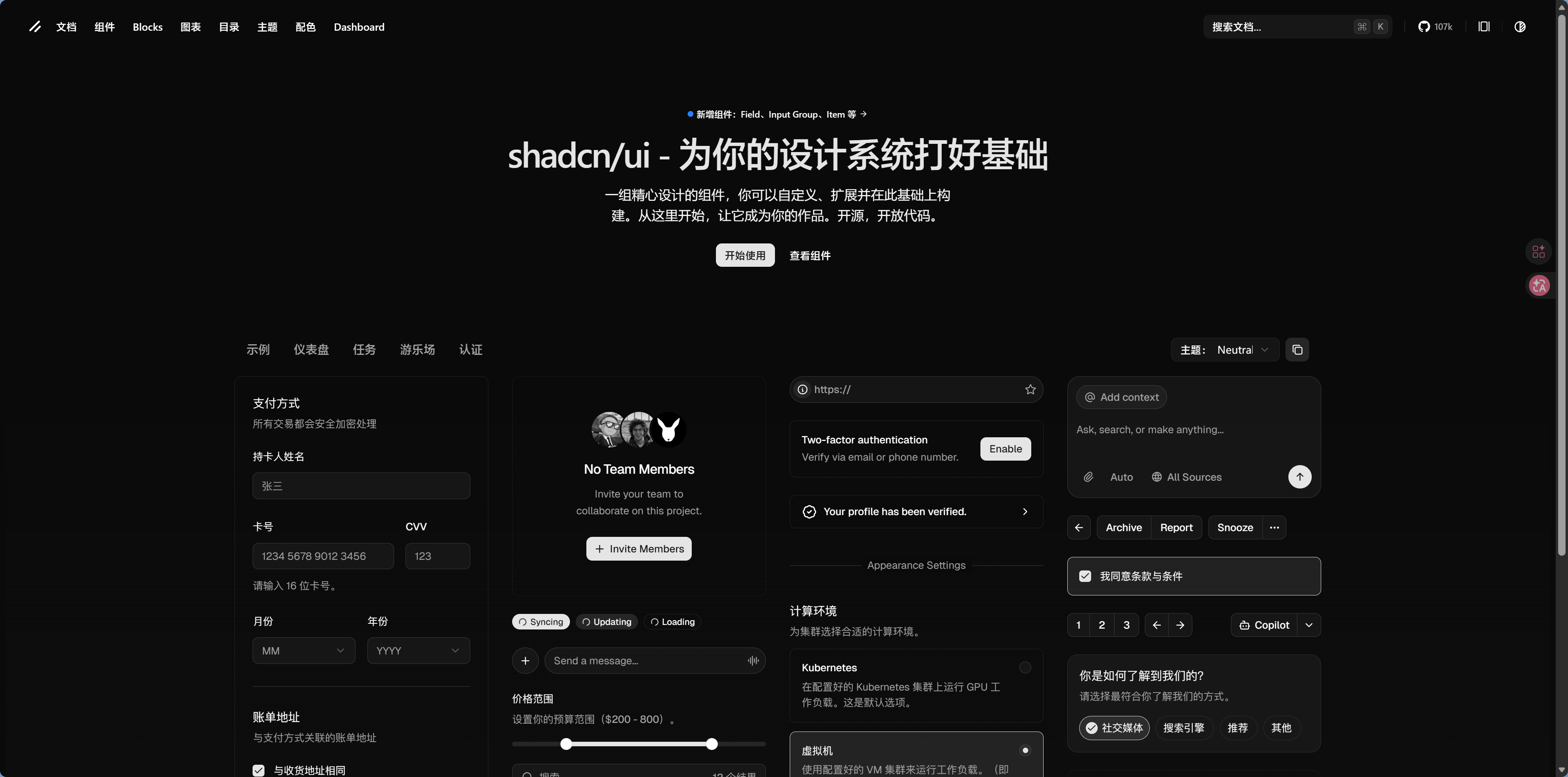
It was already introduced in the preface, but here let's dive deeper into why it's the top choice for VibeCoding.
Core idea: It's not an npm package. Instead, the component source code is copied directly into your project. You have full control.
Why it's great for AI development:
With traditional component libraries, the code is buried deep inside node_modules, so AI can't see or modify it; with shadcn/ui, the code lives right in your project folder, so AI can edit it just like code you wrote yourself.
- The code lives in your project, so AI can read and modify it directly
- High-quality components with solid accessibility support—for example, visually impaired users using screen readers can still interact with buttons and forms normally
- A rich ecosystem with plenty of extension components and templates
How to help AI use shadcn/ui well:
Tell the AI that your project uses shadcn/ui, and it will prioritize using those components.
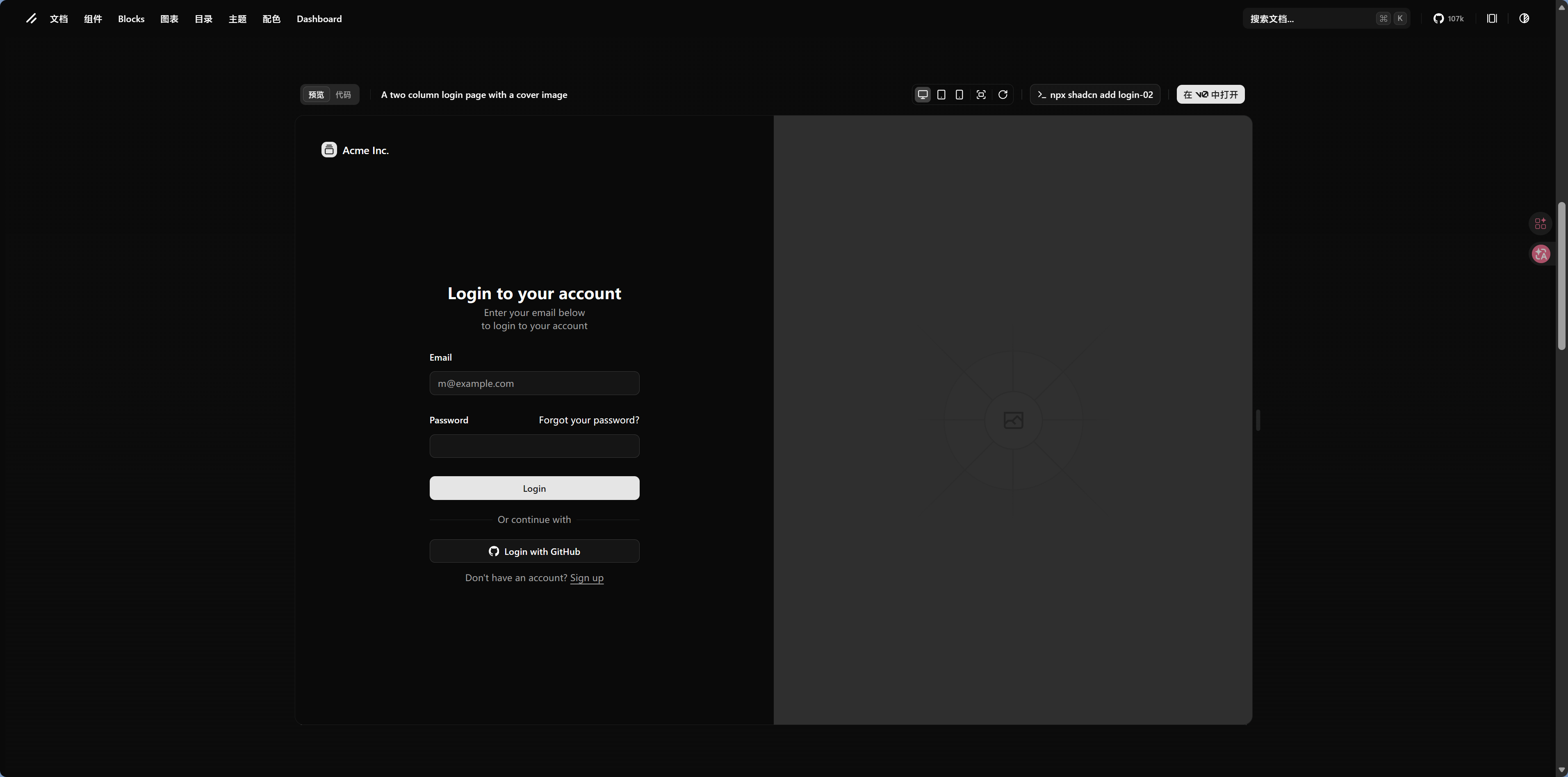
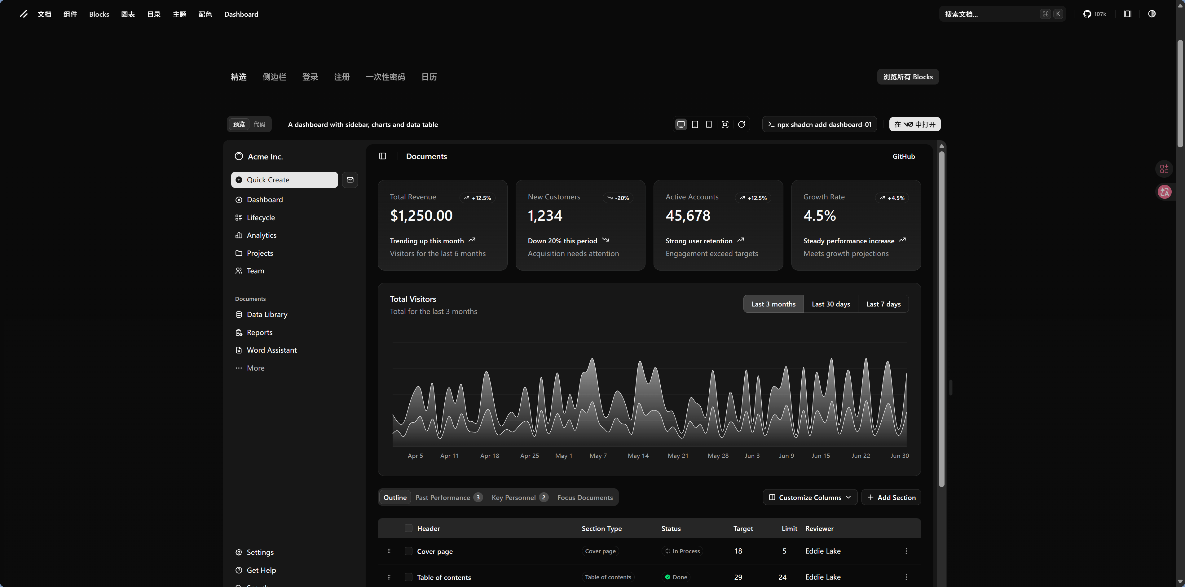
shadcn/ui ecosystem extensions:
The shadcn/ui ecosystem keeps growing, and the community has contributed many high-quality extensions:
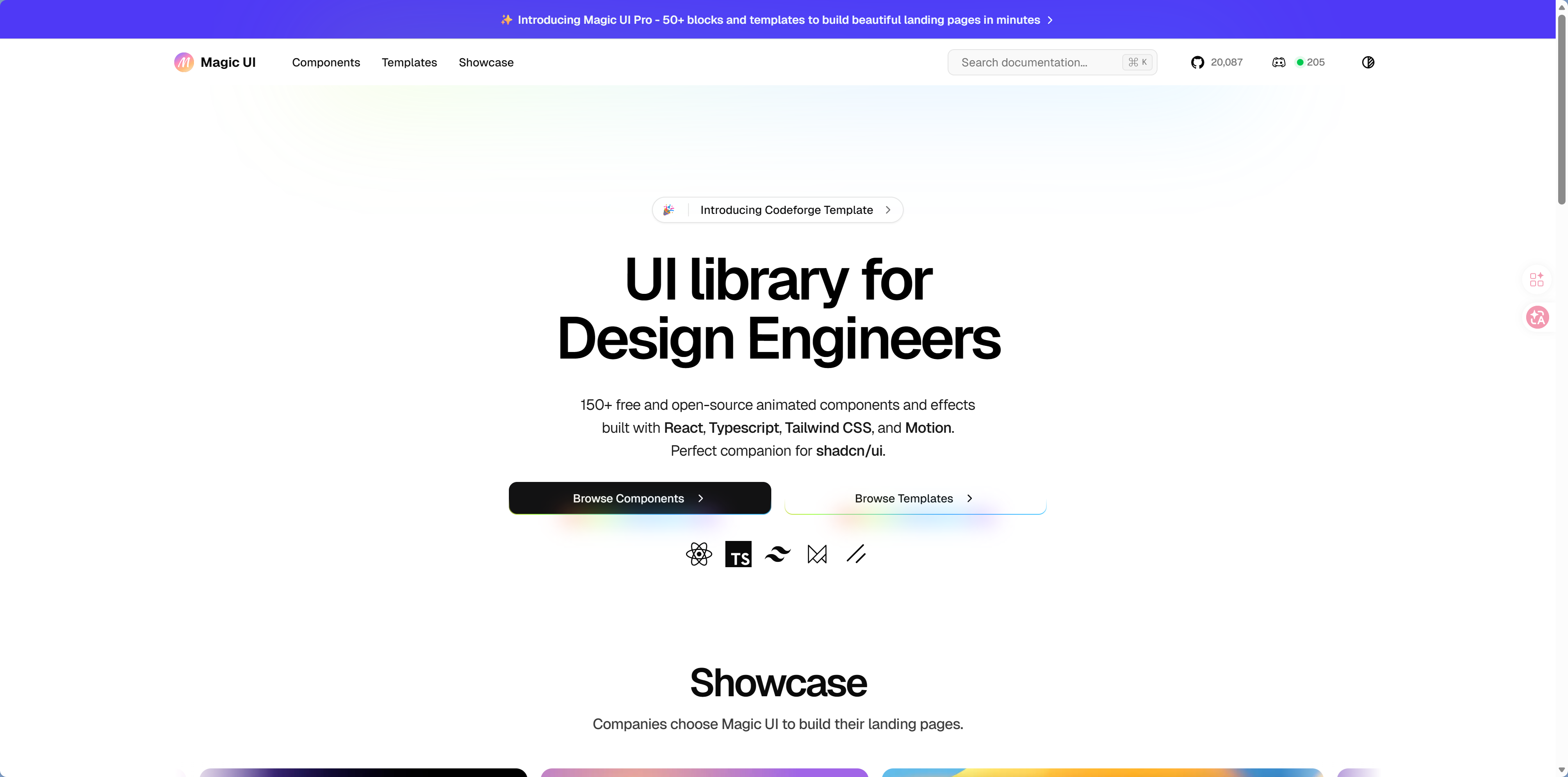
| Extension Library | Use Case |
|---|---|
| Magic UI | Animated components, special effects components |
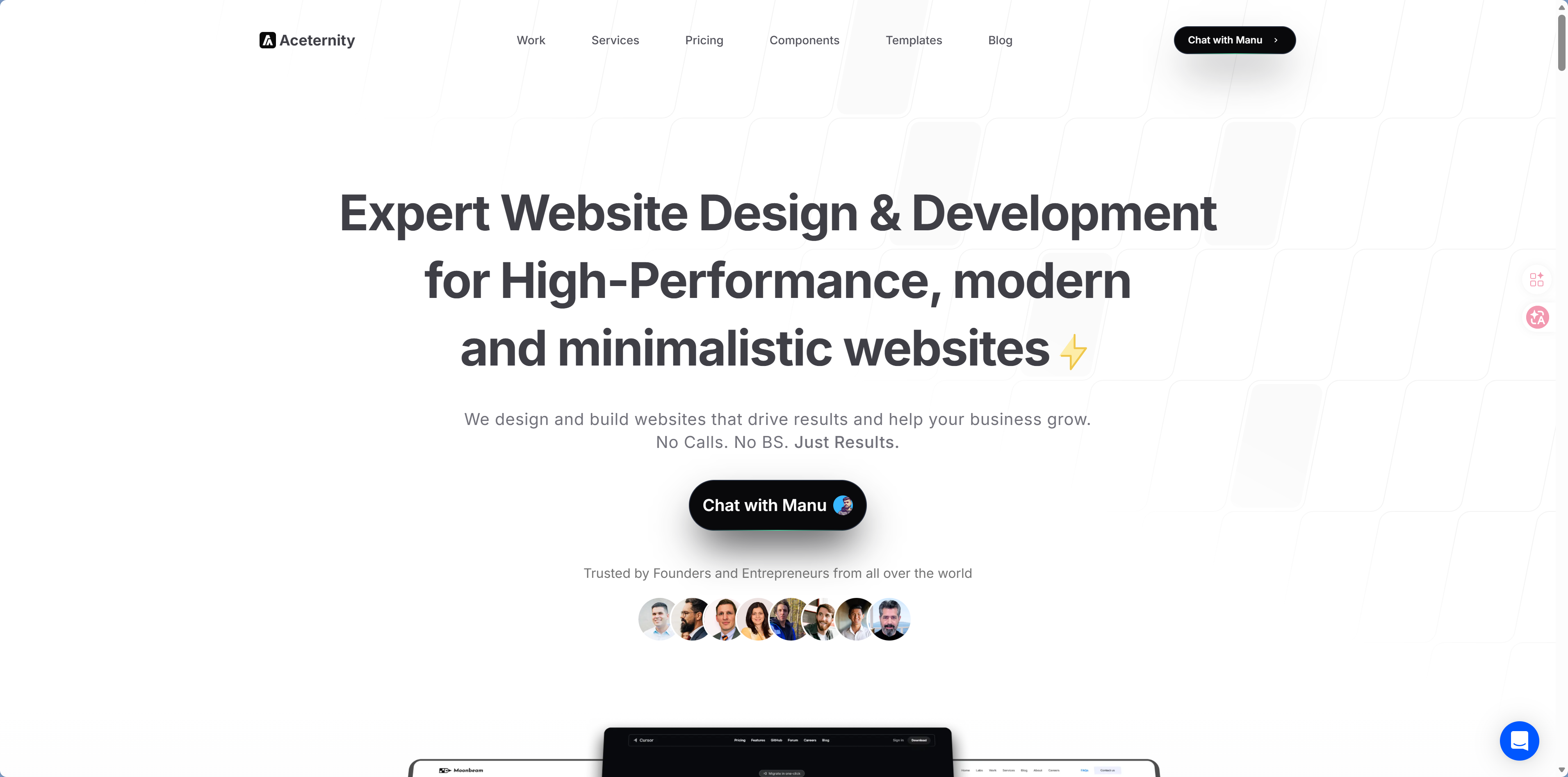
| Aceternity | Advanced UI effects components |
 |  |
Other Mainstream Component Libraries
Component Library Selection Decision Tree
你的项目是什么类型?
Let AI Help You Use Component Libraries
No matter which component library you choose, the key is to clearly tell the AI which one you're using in your prompt:
"Use the shadcn/ui Table component to display a user list with sorting and pagination"
"Use Ant Design to build an order management table with filtering and export support"
Next Step
Component libraries solve the problem of static interfaces. Want to make your pages "come alive"? Continue to 5.3 Animation and Interaction Libraries.